Reflection 1 - Evaluation of the Received Mock-up
Discuss the main challenges your group faced when working with the
received mock-up. Were there any gaps in the information provided? If
so, how did this affect your work?
The mockup we received was somewhat unclear and contained a few
contradictions. For instance, the intro text initially mentioned three
different themes for the page, but a sentence later, it referred to
four. The themes were intended to be: the intro page, the "key
messages," the "main events," and the footer. Additionally, there was
confusion in the footer regarding font color; the text stated it
should be white, yet the provided hex code was #000000, which is
black. This inconsistency left us uncertain about which color to use.
Given the dark blue background, we chose the white color, because the
black one would not provide sufficient contrast. However, after adding
a box around the text with a white background, we decided to use the
black font color for better readability.
The desktop version of the mockup included horizontal lines separating
the themes, while the mobile version did not. We were unsure whether
the lines were intended for our reference to distinguish the themes,
or if the designers meant for them to be a permanent part of the
layout. The uncertainty left us unsure about whether to include the
lines in our design. In the end we decided not to include those lines,
as we found a better solution in our opinion. Instead of using a
horizontal line, we decided to go with a linear gradient between the
themes. The gradient provided a smoother flow between sections, which
felt more natural and cohesive. By blending the colors gradually, it
created a more seamless transition that didn't interrupt the user
experience. This approach made the content feel more connected,
helping to maintain a sense of continuity throughout the design. It
also added a more dynamic and visually appealing element, which worked
better with the overall aesthetic we were aiming for. The horizontal
line between the footer and the events section serves to clearly
separate the two areas, providing a visual break that improves the
layout. The footer, with its dark blue background, is much darker
compared to the rest of the page's lighter tones. A linear gradient
didn’t look as aesthetically pleasing in this case, as it didn’t
complement the strong contrast of the dark footer The horizontal line
helps maintain a clean, organized look while ensuring the footer
remains distinct without disrupting the overall flow.
The mockup also suggested a navigation bar with a burger menu.
However, at this point, we don’t yet have enough knowledge to
implement it without using JavaScript or more advanced CSS elements
that we haven’t learned yet. Because of this, we considered a simpler
solution. The mockup didn’t provide any specific information regarding
the content of the nav bar, so we added a basic nav bar that only
includes links to the Reflection and the Newsletter page. Initially,
we also wanted the nav bar to indicate which page the user was
currently on, so we created a .active-page class that would highlight
the active page. After discussing it further, we ultimately decided to
remove the nav bar entirely, as it wasn’t necessary for the structure
of the website. The Newsletter consists of only one short page without
any links to other content that could be included in the nav bar. The
Reflection page is accessible via a link in the footer. To ensure
users could easily access the footer without excessive scrolling, we
added a scroll-to-bottom class. This element is positioned in the
bottom-right corner of the page, and when clicked, it quickly scrolls
the user down to the footer.
In both mock-up versions, the headings, such as "Key Messages" and
"Main Events," were placed within boxes. However, this design made it
harder to visually separate the content from the headings. As a
result, we decided to remove the boxes around the headings. This
change improves the user experience by providing a clearer overview of
the topics, allowing users to quickly and easily identify the
different sections.
It would have been helpful to receive more detailed information in
some areas, particularly regarding the behavior of the links. Such as
their appearance when visited, active, hovered over, or unvisited. For
example, details on the color, font weight, font style, and text
decoration of the links would have provided greater clarity. Aside
from the links, the mock-up also lacked information on other important
elements (requirements mentioned in the description), such as the use
of linear gradients, pseudo-classes (beyond the mention of the word
“here” as a link on page 4), and there was no mention of
pseudo-elements at all. Therefore, we had to discuss within the group
how to implement these elements, including their design and
functionality, to ensure the best possible user experience.
Detail any modifications you made to address the requirements outlined
in the description. Explain your approach and the specific changes you
implemented to align with these requirements (e.g., describe how you
used absolute positioning and any adjustments necessary to fulfil
these criteria).
We did some modifications and had to fill in some gaps, like finding
out how and where we would implement absolute positioning. We already
knew that we needed a background image that was in the fixed position,
and eventually we decided to use position: absolute on some of the
images (.images1, .images2, .images3 in the CSS document). On this
very same part we used the z-index to make the images overlap. We also
added a media query for larger screen resolutions (960px) at the end
of our CSS file and also one media query dedicated to the
.image-container just mentioned, because there were problems with the
size. On the .image-container we also used position: relative.
The absolute positioning removes an element from the normal document
flow, meaning that it does not affect the position of any surrounding
elements. It positions the element in relation to its containing
element. In our Code we used position: absolute; in the .image
classes. With the positioning we layered the images on top of each
other and placed them at specific coordinates within the parent
container (.image-conter). Using “top” and “margin” properties allowed
us to position the images precise and independent of other elements in
the layout.
Relative positioning allows an element to be positioned relative to
the normal document flow. This means that the element can be moved
from its original position, but it still occupies the space it would
have taken if it hadn’t been moved. For example, in the
.image-container, we use position: relative; as a reference point for
the absolutely positioned images (such as .image1) within the
.image-container. By using relative positioning, the child elements
(the images) can be positioned in relation to the container, while the
container itself maintains its place in the overall layout. This
prevents surrounding elements from shifting or collapsing, ensuring
that the page structure remains stable and unaffected by the movement
of the positioned elements. As a result, the .image-container serves
as a stable reference for positioning the images with precision.
In combination with those positionings we added the z-indexes in the
.imageX classes. With the z-index, its possible to create an
overlapping. Its determines the stack order of elements. That element
with the highest z-index value, is shown in front of those with a
lower z-index value. Although the z-index in the provided mock-up was
used in a different context, we decided to add additional images to
improve the appearance of the website. To enhance this look, we chose
images that overlap. The reason for this decision is to create a more
dynamic and visually interesting layout. By overlapping the images, we
can make the design appear more interactive, adding depth and creating
a sense of visual movement. This technique draws the user's attention
and enhances the overall aesthetic of the site.
The mock-up suggested using z-index for the background-image and the
text in the foreground. However, in our code, a Flexbox and the
absolute positioning already handle the layout well, so there is no
need for the z-index. The text sits on top of the background without
overlapping issues, keeping the code simpler and improving the
performance because the browser does not need to calculate the
stacking contexts.
Besides the background image in the header, there was no other
background image planned in the mock-up. However, we still needed a
background image, which is fixed. For that reason, we exchanged the
white background color in the first section with a background image
with a fixed positioning.
We used the :nth-child pseudo-class to change the style of every
second child in the .event-box. In this case, every second child would
have font-style: italic; font-weight: bold; margin-top: 1em; . That
pseudo-class highlights specific items without manually assigning
additional classes in the HTML. Using it makes the HTML more dynamic
and efficient.
In addition to :nth-child, we also used the :hover pseudo-class to add
interactive hover effects to links, enhancing the user experience.
When the user hovers over a link, the link changes its color,
font-weight or/and text-decoration.
Pictures not in the mock-up but we included it. The received mock-up
didn’t give us too much information about which types of images to use
or where they would be placed on the website, other than mentioning a
content box on page 1. We decided to go with the theme and found
royalty-free images.
The font choices were specified in the received mock-up, with DM Serif
Display used for headings and DM Sans for paragraphs. To implement
these fonts, we imported them from Google Fonts using the @import rule
in the CSS, ensuring that the typography aligns with the design
specifications.
Using the pseudo-element p::first-letter helps establish a clear
visual order and highlights the start of each paragraph in the
beginning of the page, which fits the usual design of a newsletter. By
giving special styling to the first letter of every paragraph, it
captures the reader's focus right away, making the content more
interesting. This method reflects the classic layout of newsletters,
where the first letter is usually bigger or styled in a unique way to
mark a clear beginning, improving both the readability and visual
appearance of the text.
In page 1 of the Mockup, there was only one content-item box. We
replaced it with three different ones. This improves the user’s
perception of the information. Each block highlights a separate
fragment of text, making the content easier to read and understand.
Additionally, this division makes the design more aesthetically
pleasing and structured. It also improves the design’s adaptability
across different devices.
Reflect on anything else you found useful during this process or any
additional insights you would like to share.
The abbreviation with the title “Click me” within the <a> tag,
“Source: WHO World Mental Health Day 2024,” indicates to the user that
it is clickable. When the user clicks on the link, it opens in a new
tab (using target="_blank"), allowing them to view the linked content
without navigating away from the current page. This enhances the user
experience by enabling easy switching between pages. Additionally, the
abbreviation displays a tooltip, providing further context and
informing the user that the link is interactive.
Our assets folder contains only image files such as PNG, JPG, and SVG
formats. This structure helps keep visual content organized and
separate from other project files like HTML and CSS. By storing all
image assets in one location, it ensures easy access, reduces clutter
in other parts of the project, and simplifies updates or changes to
the images without affecting other resources.
Conclude this reflection by rating the effectiveness of the mock-up on
a scale of 1 to 5, with 5 being
excellent. Be honest with the rating.
We would rate the effectiveness of the mock-up at
3.75/5. While it provided a solid foundation for the
overall design, including clear guidance on fonts, colors, and layout,
it fell short in offering enough detail on crucial aspects such as
link behavior, pseudo-classes, and some content inconsistencies. These
gaps made it necessary for us to make design decisions based on our
own interpretation, which sometimes led to uncertainty. Overall, it
was useful but could have been more thorough in its guidance.
Reflection 2 – Self-Assessment of Your Own Mock-up
In hindsight, do you believe your mock-up effectively addressed the
project’s objectives? Reflect on its strengths and weaknesses.
In hindsight, our mock-up addressed many of the project’s objectives,
but there were both strengths and weaknesses.
The mock-up was informative and gave clear guidance on key design
elements like font sizes, styles, and weights. However, instead of
using relative terms like "bigger" and "smaller" it would have been
better to provide more precise sizes for the texts and headings. It
also provided instructions on where to use linear gradients, the exact
hues of colors, and details about pseudo-classes, absolute
positioning, and z-index for layout control.
Our mock-up lacked a description or explanation for the background
image, as well as any specific motives we considered using. While we
discussed potential themes related to mental health and explored
options on platforms like Pinterest, we did not write our ideas in the
mock-up. Although we indicated where the images would be placed on the
website and how three of them would overlap using z-index.
Additionally, we didn’t give much attention to pseudo-elements, which
could have further enhanced the design.
Consider the challenges faced by other groups when implementing your
mock-up. What aspects may have been difficult for them?
One potential issue is the readability of our sketches. Since most of
the pages were drawn and written with a pencil, the low contrast
between the pencil and the paper may have made it harder to read,
especially because we scanned the pages with the Notes App on iPhone.
Some of the handwriting appears rushed, which may have contributed to
further confusion or misinterpretation. While we did include key
information, certain sections lacked detail and clarity, leaving some
aspects open to interpretation. More precise and well-defined
instructions would have improved the overall usability of the mock-up,
making it easier for others to implement.
If you could revisit your design, what changes would you make to
improve it? Be honest and critical in your assessment.
First, we would prioritize readability by using a pen or stronger
pencil strokes for better contrast, ensuring the mock-up is clear and
legible. Instead of scanning the pages with the iPhone Notes app,
which can sometimes compromise quality, we would take high-resolution
pictures for a sharper and more professional presentation. This would
improve both clarity and accessibility. We would also ensure the
design is more detailed in certain areas. For example, we would
include precise measurements, color codes, and font specifications,
rather than vague descriptions like "bigger" or "smaller," to minimize
confusion. Additionally, we would focus on making the handwriting
neater and more consistent throughout, so it's easy to read for anyone
implementing the design.
Reflect on anything else you think might be useful or relevant to
mention regarding your own mock-up.
Although we were a bit rushed and didn't have a lot of time to work on
it, we think our mock-up turned out well. We managed to create
something that effectively communicates our design ideas and
demonstrates the overall look and feel we were aiming for. While there
are certainly areas that could be refined with more time.
Finish this reflection by rating your mock-up on a scale of
1 to 5, with 5 being excellent.
3.75/5
The mock-up we provided was solid overall and showed our design
intentions. It clearly showed where images and text should be placed,
giving a good sense of the layout. However, there are several areas
where it could have been improved for better readability and clarity.
The use of pencil made some parts difficult to read, and rushed
handwriting contributed to a lack of precision. More attention to
detail, such as including exact measurements etc., would have helped
others follow our design more easily. Additionally, while the general
structure was solid, we could have added more instructions for
elements like pseudo-classes and background images. These refinements
would have made the mock-up easier to implement. Although the design
was functional and conveyed the essential ideas, there is room for
improvement.
Reflection 3 – Sustainability Assessment
Describe the measures you implemented to reduce your mock-up's carbon
footprint and overall file size.
One of the first steps we took was to improve how we load fonts.
Instead of importing the entire Google Fonts family, we selectively
included only the font styles and weights that we needed. This
decision not only minimized the overall size of the font files but
also reduced the number of server requests. By using the @import rule,
we ensured that fonts are cached in the browser, reducing the load
time for repeat visitors and contributing to a more efficient page
load process. When we initially looked at our asset folder, we noticed
that we were using uncompressed PNGs and JPGs, which added unnecessary
file size to the site. To change this, we used image optimization
tools like Picflow and ShortPixel. With those pages we compressed the
images without sacrificing quality. We also replaced some of the
raster images with SVGs, which are scalable and much lighter in file
size. Additionally, we implemented lazy loading for images, ensuring
they are only loaded when they are needed as the user scrolls down the
page. This reduced the amount of data transferred initially, speeding
up the page load time and reducing bandwidth usage. At first, we
considered using two separate CSS files but decided to consolidate
them into a single file. One for the general CSS and the other one
only for the Media Queries. Using two different CSS can be beneficial
for keeping the code organized and improving maintainability. While
using one CSS file increases the file size slightly, it significantly
reduced the number of HTTP requests made to the server, which improved
the page load time. To further enhance performance and simplify our
styling, we adopted Flexbox for creating flexible, responsive layouts.
Flexbox allows for more control over alignment and distribution of
elements, reducing the need for additional CSS rules or complex CSS
code. In terms of structure, we made sure to use semantic HTML
elements such as <header>, <nav>, <article>, and
<footer>. This not only improved the overall readability of the
code but also enhanced the site’s accessibility and SEO.
Quantify your efforts: How many kilobytes (kB) did you save after
applying these measures?
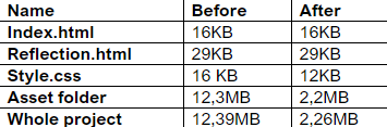
12,4MB – 2.3MB=10,1MB = 10,342KB
Discuss the challenges you faced during this process. How difficult
was it to make these changes?
In the process of reducing the overall file size, one of the main
challenges was finding the right balance between optimizing the design
and maintaining its visual quality. For example, compressing images
was an important step in reducing file sizes, but in some cases, this
led to a noticeable drop in quality. We had to experiment with several
compression levels to ensure that the images were optimized without
losing too much clarity. While working on compressing images for
better sustainability, we struggled to get the file sizes as small as
we wanted. We initially tried using AVIF format, which can reduce file
sizes by about 50%, and used Picflow for the conversion. However, we
noticed that some images ended up slightly larger after compression,
so we knew we needed a better solution. That's when we remembered
ShortPixel and decided to give it a shot. It worked perfectly,
significantly reducing the file sizes and giving us much better
results. To fully optimize the compressing of the images we used the
SVG format for a couple of the images, sadly most of the images
weren't available as SVG. Thanks to these optimizations, the images
now load faster and use less bandwidth, making the site more
sustainable.
Provide specific examples of your actions, such as any format changes
made to images.
We first tried to use AVIF for changing the format, but quickly
realized that there was better solutions, although AVIF works, we
found ShortPixel very useful and it compressed our images to an extend
we wanted, after this we used SVG for a couple of the images so every
image has the lowest file size possible.
Consider including a table that compares the file sizes before and
after your modifications.
Reflect on anything else you found relevant or useful regarding
sustainability in your design process.
We found using Shortpixel to compress the photos to a much lower file
size was very useful for our sustainability. While working on the
design, we realized the importance of a sustainable approach to web
development, both in terms of file optimization and reducing the
carbon footprint, and in creating a more efficient user experience.
Using techniques such as font optimization, image compression, and
code minimization not only reduces the load on servers and energy
consumption, but also affects the performance of the site, which
ultimately improves the user experience. Also, minimization code and
removing unnecessary elements makes the project easier to maintain.
Clean, compact code is easier to update and adapt, which makes the
project more sustainable in the long term. While working on the
project, we also noticed how important small improvements are. Even
minor changes such as image compression or reducing the file size by a
few kilobytes can have a significant impact on overall energy
consumption. In the future, we plan to pay more attention to
sustainability in design, especially when working on large projects,
where each optimization can have a significant impact.